Last week we asked our newsletter subscribers to nominate a favourite design-related book that they’ve turned to for inspiration in these strange and stressful times and would recommend to others.
We had a great response to the call-out and our highlights from the suggested titles are below. Thanks to everyone who has contributed to our lockdown reading list so far — details of how you can add your book to the ongoing list are at the bottom of the post.
The latest additions to the post will appear here at the top.

Rosmarie Tissi: Graphic Design by Rosmarie Tissi, 2019
Nominated by Ana Bettencourt F., Visual + Graphic Designer & Assistant Researcher at ITI
Rosmarie Tissi’s oeuvre over 60 years of professional experience as a graphic designer is so vast that one book is not enough to show you all of her works, but this one gives you a broad sense of her way of interacting with the grid, her playfulness, her imagination and her expressivity. Tissi is one of a very few of her time to earn a name for herself in graphic design from early on — and this book is her first solo monograph.

West-Berlin Grafik-Design. Graphic Design behind the Iron Curtain by Jens Müller, 2019
Nominated by Ana Bettencourt F., Visual + Graphic Designer & Assistant Researcher at ITI
I would like to recommend this book; it is a bit small (A5 size) for my taste, but nevertheless is a beauty. It is especially peculiar since it relates somehow to the current situation of self-isolation we are facing worldwide. Despite all the obstacles we are encountering now — as with the ones the people faced in West-Berlin behind the Iron Curtain — one thing is certain, sometimes self-isolation can bring about the most unique and revolutionary results, exceeding our initial expectations.

Munich ’72 – The Visual Output of Otl Aicher’s Dept. XI by Mark Holt
Nominated by Ana Bettencourt F., Visual + Graphic Designer & Assistant Researcher at ITI
One of my favourites in terms of content and 100% recommended. Beautifully designed and with a huge amount of research, this book is the first to shed light on the visual output of Otl Aicher’s Dept. XI and their contribution to the Olympic Games design. It is visually inspiring and contains insights into the design team’s efforts and their unique way of thinking.

Diseño Gráfico en Venezuela by Alfredo Armas Alfonzo, 1985.
Nominated by Ana Bettencourt F., Visual + Graphic Designer & Assistant Researcher at ITI
Growing up [one is] surrounded by colours and visual stimulation, just like the cover of this book. It is mesmerising. I have been searching for this book for some time since only a few copies were printed at the time of its publication and it was difficult to find one in good condition. This collection is about the golden age of graphic design in Venezuela, compiled and packaged in a single edition with considerable dimensions. It is like a gem of timeless design.

LogoArchive zines by Richard Baird, 2018-2020
Nominated by Ana Bettencourt F., Visual + Graphic Designer & Assistant Researcher at ITI
This recommendation is not a book, but a compilation of zines initiated by Richard Baird in collaboration with several designers in the field. If you love timeless logo design, then these editions are a delight for your eyes. Each upcoming issue is an evolution of the previous one. Grab a cup of coffee and enjoy the read!

The Medium is the Massage by Marshall McLuhan and Quentin Fiore (Penguin 1967)
Nominated by Graham Wood
The Making of Kubrick's 2001 by Jerome Agel and Quentin Fiore was my introduction to Fiore’s work, when I was about 11. I don’t remember how I got hold of it, and I hadn’t seen 2001, but the type/photo/layout of the thing fascinated me. It felt like I was falling into another world — which I suppose was the point.
Much later, I discovered Fiore’s wider body of work, and The Medium is the Massage is the iconic exemplar of his approach to the book as an expressive, kinetic object. I Seem To Be A Verb, with Buckminster Fuller, is probably more gloriously vivid, but Medium has a power and a visceral nature which is pretty much definitive.
These books were also an inspiration for my own books, Tycho’s Nova and (more pertinently!) Memory Is The Medium. There’s a great book on Fiore’s work, The Electric Information Age Book, by Jefferey T. Schnapp and Adam Michaels which is definitely worth picking up.

25 Publicity Campaigns by Erberto Carboni
Nominated by Randall Ross, Modernism 101 Rare Design Books
Consistency can either be a blessing or a curse, depending on ideology and execution. Erberto Carboni’s collection of 25 Publicity Campaigns (Greenwich, CT: New York Graphic Society, 1961) remains one of my go-to volumes for inspiration and contemplation on the virtues of consistency.

Reasons To be Cheerful: The Life and Work of Barney Bubbles By Paul Gorman
Nominated by John Rooney, Practice+Research
The book explores the work of the enigmatic designer/typographer/painter/furniture-maker and light show operator for Hawkwind, Colin Fulcher AKA Barney Bubbles.
Before I got this book, I knew of his work but not him. He never signed his work, but in his hidden identity, Bubbles’ work resonates with a constant intensity to this day. This book captures his style of visual collusion with type and image and presents ‘Graphic Design’ as a spectacular connective window into a wider world of arts and crafts practice. Essential.


Various book and catalogue covers by Sebastião Rodrigues
Nominated by José Mendes, Graphic Designer
It is a delight to find and devour graphic objects designed by the Portuguese designer Sebastião Rodrigues. Even though most of them are from the 1960s and 70s, or have appeared in countless publications, the moment I meet one is always a novelty.
There is a beautiful seduction in the visual compositions, in the plastic simplicity between the relation of shapes, typography and colour — and often by humour in the representation of an idea.
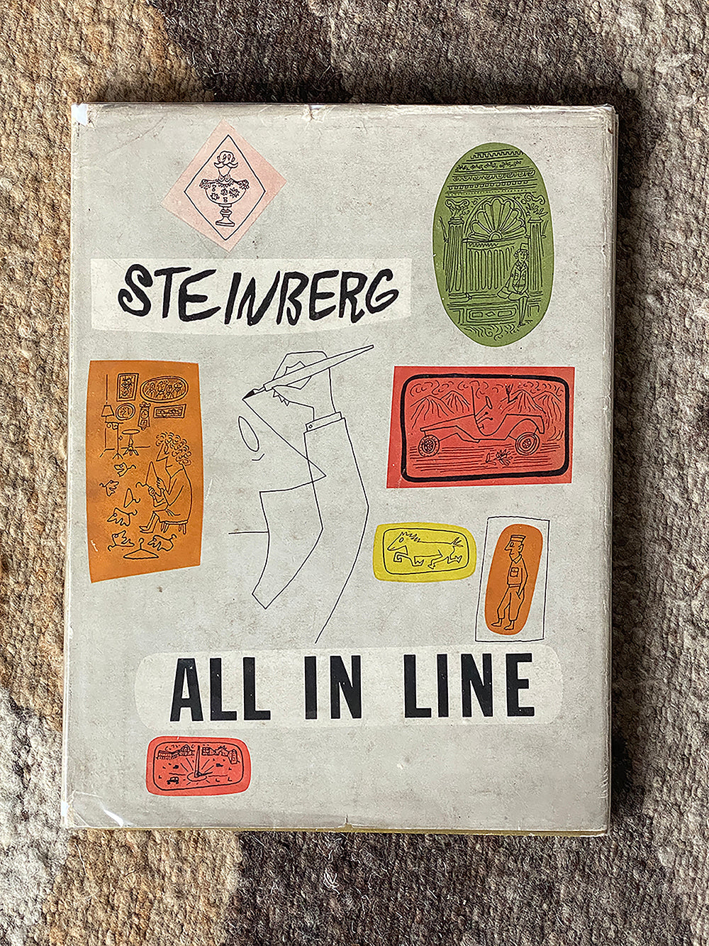
All in Line by Saul Steinberg (Penguin Books 1945)
Nominated by Julian Roberts, founder and designer at Irving & Co.
In these strange times I often find myself reaching for this book. It was Steinberg’s first book comprising of 200 drawings with a few words thrown in. It was published in the aftermath of WWII, where he was stationed with the armed forces in North Africa, Italy, China and India.
I find his succinct humour and observations of those challenging times both comforting and moving. A tribute to the best in human spirit.


Soviet Space Graphics — Cosmic Visions from the USSR
Nominated by Nathan Adams, With Lasers
It’s a very new addition to my library (in fact a post-isolation addition), but has been something very different to inspire me, and I can sense future me wanting to come back to this in years to come on a regular basis.
I’ve always been an avid space fan, and the iconography of especially the US space program in many ways was part of the attraction (it’s good to see the NASA worm returning in 2020!). It’s only the last few years though that I’ve started to explore what the Russians were doing, and it’s so different in its nature — and as a result completely mesmerising.
A couple of pages picked at random (above), showing some of the beautiful work inside, from the magazine Technology for the Youth — for me just capture this very different attempt at capturing this new and brave world, as the space race proceeded.

Apollo in the Democracy by Walter Gropius
Nominated by Giovanna Lanzilotta, Senior Graphic Designer at Design Team in Pendragon PLC
This book is not only about architecture but above all about how the love for beauty can generate ethic values in people, and how this makes us happy in a community. It seems to me that we need to remember this now. Gropius is one of the most amazing minds of the previous century and I think this book can remind us how to re-think new paradigms about society.
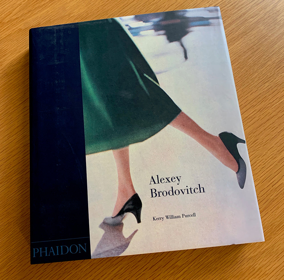
Alexey Brodovitch by Kerry William Purcell
Nominated by Greg Dodds, Creative Director, La Fabrica Design Studio
It has to be Alexey Brodovitch by Kerry William Purcell (Phaidon). I do quite a bit of editorial design (among other things) and have found the work of Brodovitch hugely inspirational — Purcell’s book is a few years old now but the writing and design is superb.
It’s always a pleasure to look back over the fruits of Brodovitch’s thinking and execution; he was obviously a hard taskmaster, for students and work colleagues, but that’s because he knew what he was doing was right!

Landscapes of Communism by Owen Hatherley
Nominated by Nigel Ball, Senior Lecturer/BA (Hons) Graphic Design Course Leader, University of Suffolk
I’m currently reading Landscapes of Communism by Owen Hatherley, a title I’ve been meaning to get around to tackling for some time. Having fleetingly visited Romania for the first time in 2018 (my first visit to Eastern Europe), and teaching on a design course with many students from Eastern Bloc countries, I was eager to find out more about where they come from and this part of the world.
I am accompanying reading Landscapes of Communism with Google Street View visits to Moscow, Poland, Czechia and Romania. As a result I feel like I am escaping my immediate environment by getting a virtual sense of Eastern Europe through its architecture, Hatherley’s exceptional contextual knowledge and personal experience, and his biting critique and acerbic wit.
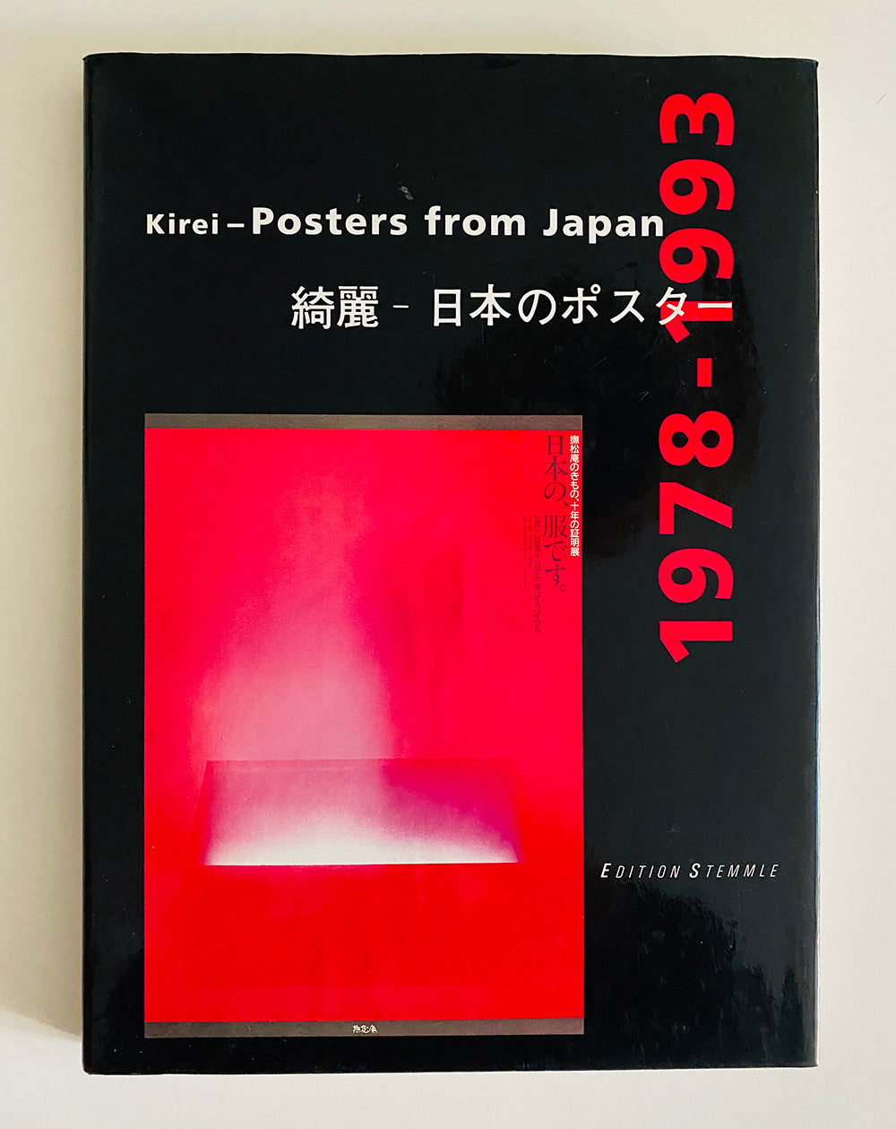
Kirei — Posters from Japan (1978-1993)
Nominated by Tom Muller, helloMuller Ltd
I bought this book in 1993 as a design student from a book discount warehouse (I bought most of my books from places like that back then). It’s a treasure trove of amazing work, chronicling decades of timeless design that is never too far away from me.

Dutch PTT catalogues designed by Irma Boom / Visual Thinking by Henry Wolf
Nominated by Simon Case, Director, Chromatic Brands
Three very different ‘go-tos’ from our library. The first two, Dutch PTT catalogues by Irma Boom (above), are so beautiful they never fail to provide inspiration.
The third book, Visual Thinking by Henry Wolf, is probably not too widely known, but is a brilliant reference book of techniques to use when we’re ‘stuck’. Stylistically, it hasn’t dated well, but the ideas are all still well worth having!

User Friendly by Cliff Kuang with Robert Fabricant
Nominated by Laurel Wilson
The product of natural storytellers who dive deep, User Friendly digs into technology and empathy, and the contribution that designers can make to build a conscious society. It’s wonderfully engaging.

Gerrit Rietveld — Wealth of Sobriety by Arjan Bronkhorst
Nominated by Marga Scholma, Beukers Scholma Grafisch Ontwerpers
We would like to recommend one of our dearest books: Gerrit Rietveld — Wealth of Sobriety. Apart from the beautiful photos by Arjan Bronkhorst of Rietveld’s ingenious lesser-known houses and the very personal stories of the residents who live with full commitment in these houses, it is especially the simplicity that speaks from his designs.
So clear, so minimal. And at the same time just enough. Especially in this bizarre time, it is so refreshing to read and see. We heartily recommend it! More information about the book is at lecturacultura.com.

Cultural Amnesia by Clive James
Nominated by Daniel Green, Lead Graphic Designer, Foth & Van Dyke
I’m rereading Cultural Amnesia by Clive James. Though I was originally drawn to it by Louise Fili’s dustcover homage to Peter Behrens, the author’s dexterity in connecting ideas quickly pulled me into the content. As I write this from the US and my home state of Wisconsin, I find his words to be both a dire warning and a hopeful medicine.

Staatliches Bauhaus in Weimar 1919—1923 (original layout by László Moholy-Nagy, cover design by Herbert Bayer, reprint edition)
Nominated by Leonardo Sonnoli
All my books are in the office that I closed one month ago. The last night I left it — with the idea that I had to stay home only few days — I brought just the books my backpack contained. The books are related to some of the principles of design: the knowledge of the avant-garde and the contemporary re-use of it, women in design, the ethic vs. the aesthetic.
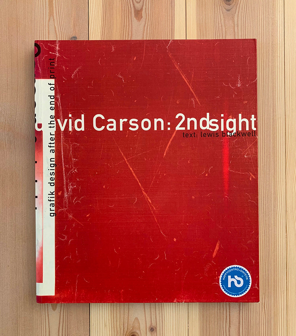
2nd sight by David Carson
Nominated by Giuliano Garonzi, Graphic Designer, Studio Garonzi
This book has been with me for many years now as [David] Carson was a strong influence in the beginning of my career (and in a way he still is). Never for his style, but I would say for the absolute need to research something new in design. I studied graphic design in Verona, Italy and of course my studies have been influenced by the Italian school (and a bit by the Swiss school). So that means grids, Helvetica, Garamond and so on.
When I was 23 I opened my first studio and while freelancing for McCann I found out a copy of Ray Gun lying around in their Rome office. I would say that from that moment on my approach to design and the discipline changed drastically. The pioneering spirit that Carson ‘taught’ me lives on in my studio today.

How To Be An Illustrator by Darrel Rees
Nominated by Bruno Miguel de Melo Dias
I am dedicating more time to this book in particular because I’m in the process of trying to do illustration for living; to become an illustrator. And, even though I already do a bit of illustration work, I find this book super well organised and straight to the point. It’s very well written and edited; I deeply recommend it, especially for people who are or want to become illustrators.
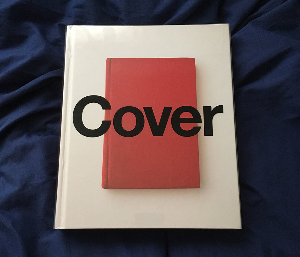
Cover by Peter Mendelsund
Nominated by Scott Saslow, freelance graphic designer
One of the books I always turn to for inspiration is Peter Mendelsund’s monograph, simply titled Cover. Mendelsund is a book cover designer (and currently creative director at The Atlantic) and he has a wonderfully minimalist style, though there are certainly exceptions.
As someone who often works on theatrical key art and home video releases, I’m naturally drawn to anyone who can sum up a narrative in one image. And Mendelsund is an inspiration for me in particular ... we both started in completely different fields. My dreams of being a filmmaker sailed a long time ago; and before becoming a book cover designer, Mendelsund was a concert pianist!

Vaughan Oliver: Archive / Photography — Adapted from the Life Library of Photography / Peepholism — Into the Art of Morrissey
Raymon Alfonso Ruiz, Extinction Burst record label
As we’re learning about different design and printing techniques, the VO:A book has really helped us push our desire to want to learn more and one day develop our identity. We’ve always loved old family photos from the mid-century era — and, growing up, The Smiths were a huge influence on us, not just musically but aesthetically as well.

Design: The Invention of Desire by Jessica Helfand
Nominated by Eric Heiman, Principal, Volume Inc.
I’m rereading Jessica Helfand’s Design: The Invention of Desire because these times warrant a deeper dive into both asking the necessary whys of what we design and the ramifications, ethical or otherwise, once we’ve designed it.
This book bowled me over the first time I read it and I’m looking forward to rethinking its lessons in this much different context we’re living in.
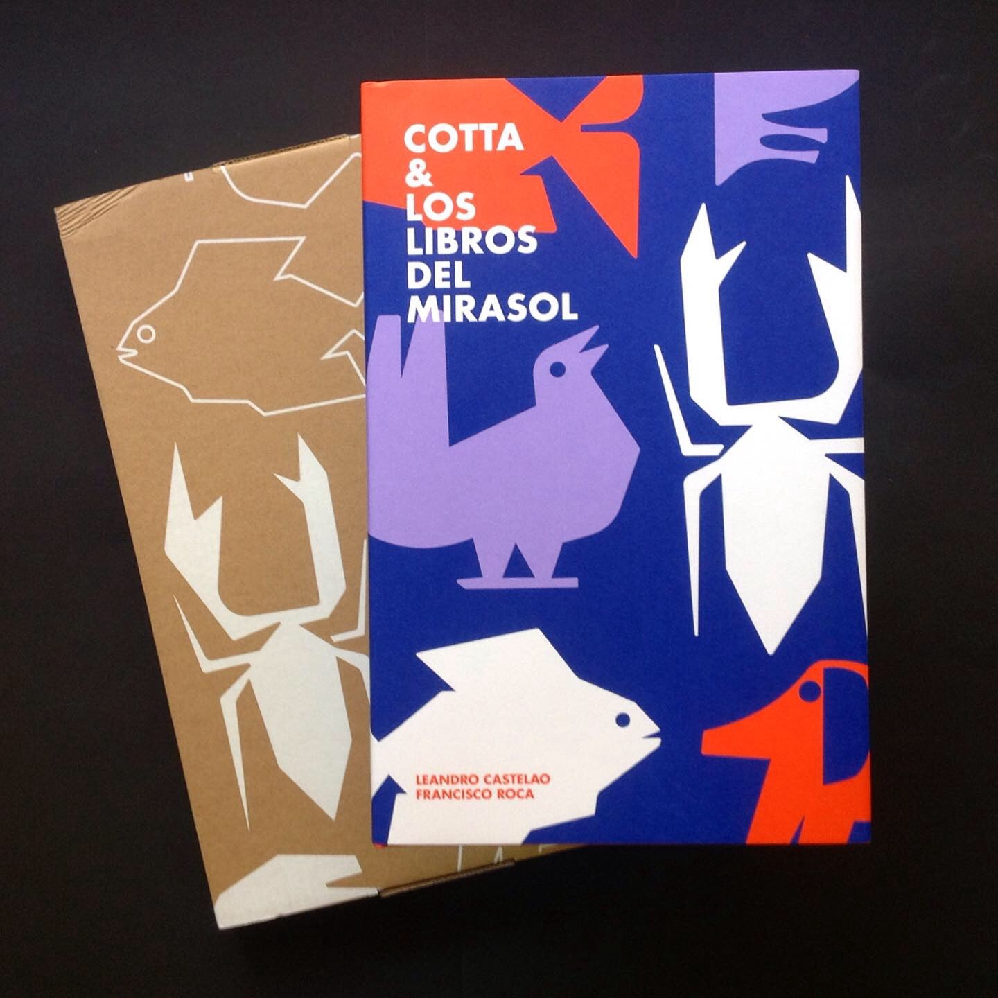


Cotta & Los Libros del Mirasol by Leandro Castelao and Francisco Roca
Nominated by Lucas López
A graphic masterpiece. An edition of historical and visual value that rescues the 103 covers designed by Cotta for Los Libros del Mirasol, between 1959 and 1962.
‘Cotta's graphic work is one of the missing links between South American publications and European modernist traditions,’ says Steven Heller about Argentinean illustrator Juan Ángel Cotta. With design and research by Leandro Castelao and Francisco Roca, and published by Flecha Books, Cotta & Los Libros del Mirasol stands out as one of the best publications of 2019.
If you would like to contribute to our lockdown reading list, please email Mark with a few lines on your chosen book and a photograph of the cover (1000 pixels wide).
]]>


 ]]>
]]>