There are, in fact, four IBM design manuals featured in Manuals 2: Design & Identity Guidelines. Images from three are shown here, as part of our final case study on some of the outstanding projects in the M2 collection, posted to coincide with our Kickstarter campaign to republish the book – which is live now. With your help we can bring this important title back into print!
In the IBM chapter in Manuals 2, alongside images from the documents that focused on the graphic identity for the corporation’s Product Center and its Sign Standards, two manuals – from 1978 and 1990 – concern themselves specifically with the classic Paul Rand-design logo and its usage.

IBM’s understanding of the role of design in business had begun to emerge in the early 1950s after Thomas J. Watson Jr (son of IBM founder Thomas J. Watson Sr) visited the Olivetti shop on 5th Avenue, New York City. The Italian firm’s typewriters were manufactured in bright colours and boasted ultra-modern styling.
The Olivetti shop was vibrant and contemporary; by comparison, IBM’s offices were drab and uninviting, its computers dated and unstylish.
Watson Jr resolved to “put my stamp on IBM through modern design”. To this end he hired the well-respected architect and former curator of industrial design at New York’s Museum of Modern Art, Eliot Noyes, as IBM’s design consultant.

Noyes brought in many of the leading creative talents of the era, including Charles and Ray Eames, Eero Saarinen and Isamu Noguchi. One of his shrewdest moves was to appoint Paul Rand, the legendary graphic designer, to design the IBM logo and the company’s house style.
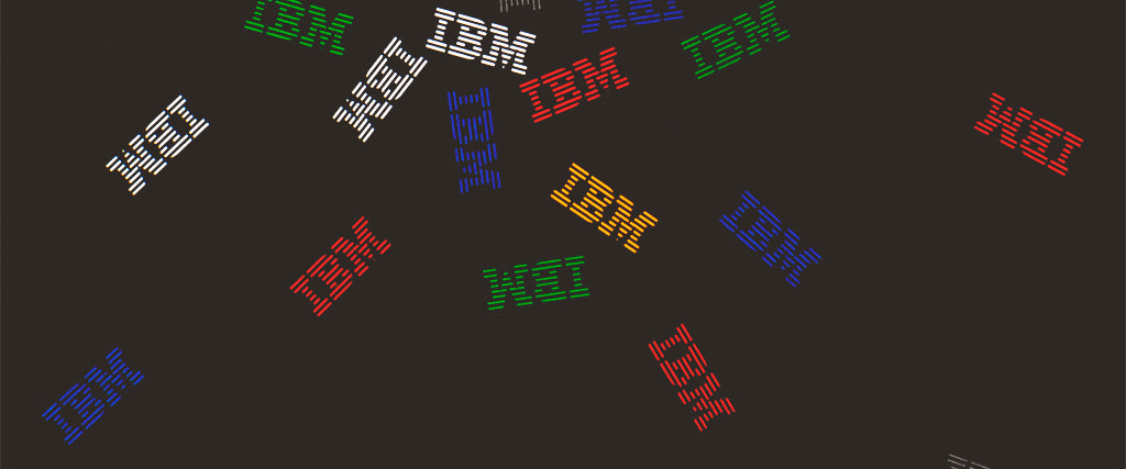
Rand evolved his original 1956 design into a version constructed from 13 stripes in 1966, refining this again – to an eight-striped iteration – in 1972. In 1978, IBM published The IBM Logo: Its Use in Company Identification. “It is the graphic designer who, in a myriad of ways, is confronted with the problem of using the logo effectively,” the Introduction stated.
“Effective use implies not only an awareness of special design problems, but also an awareness of semantics – the meaning and relationship of words and pictures.

“It further involves some understanding of people’s reactions to visual things. Often we say that a thing is beautiful if it works. A beautiful looking chair that offers little comfort is not a beautiful chair. The idea of discomfort affects the viewer’s impression of its appearance.

“Similarly, a printed piece that is attractive to look at but difficult to understand is not beautiful because it is not useful. In short, form and function are inseparable.”

The corporation’s 1990 manual, The IBM Logo, took this exploration further. “The design of the IBM logo, like any design problem, is one of integrating form and substance – of making three familiar letters of the alphabet look different, attractive, memorable, and adaptable to an infinite number of applications,” it explained.

“The most unusual aspects of the [IBM logo] design are the square counters of the B and the asymmetric serifs of the M – visual cues to aid recall.... Even the slightest suggestion of stripes says IBM.”
This last point was proven by the striking use (or non-use) of the logo on the manual’s cover, as shown below.

Four IBM design manuals are featured in our book, Manuals 2. With your help we can republish the title – visit our Kickstarter to find out more about the publication and to see the rewards available.