Over the next few weeks we’re going to be featuring a selection of highlights from our Letraset book, our visual history of the rubdown lettering system that revolutionised typographic expression. In our first post we look at how Letraset helped to bring about the visual language of punk and became a staple of the DIY attitude to music-making established in the late 1970s and early 80s. Letraset: The DIY Typography Revolution is available now from the Unit Editions shop.
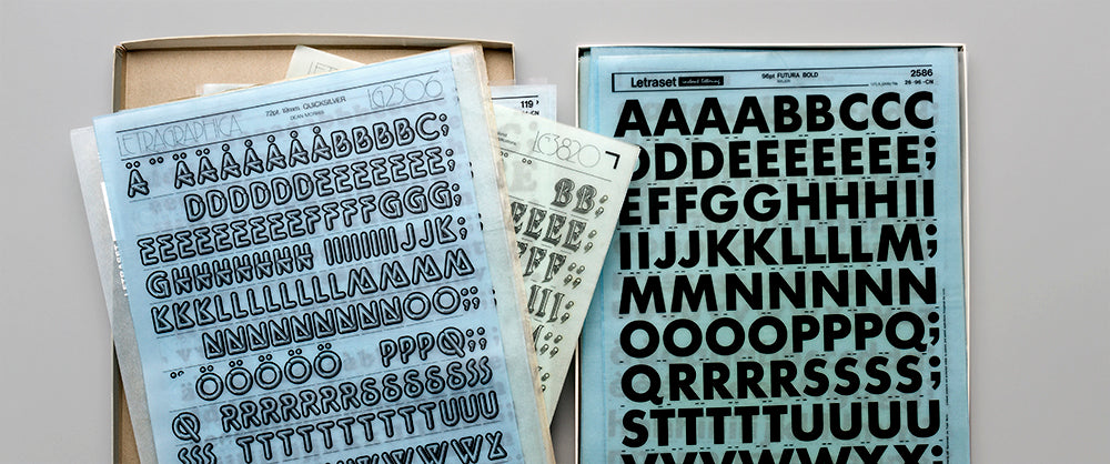
In recent years, articles on Letraset have appeared in leading design magazines, and events have been held celebrating the craft and expert knowledge that underpinned the making of the Letraset typographic system. This enthusiasm extends to a new younger generation of designers who have known nothing but the computer screen and the frictionless world of Adobe software.
There is also a cohort of designers – now mostly in their forties – who owe their initial interest in the subject of graphic design and typography to an early encounter with Letraset. For many, the first sighting of a Letraset catalogue was the door to a world of discovery.

Compacta, the first Letraset original typeface, 1963
As David Quay (responsible for around 40 Letraset typefaces) notes elsewhere in this book: ‘With Letraset everyone became aware of type. A school kid doing a poster for the school jumble sale, or a graphic designer doing a record cover. They all had easy access to type.’
Andy Stevens, co-founder of Graphic Thought Facility, a highly regarded British design group, found that by ‘pouring over my Letraset book I realised that images and codes that I knew from record covers, had been culled from this catalogue of metaphor and style, and now I was able to access them too. This opened up the well signposted path of observation and appropriation and use of context as graphic devices that I still apply as tools today’.

Helvetica Medium
For most designers, however, it was the hip typefaces of Letraset, and the sheer malleability of the rubdown system, that excited them. Here was a way of creating zeitgeist-fuelled graphics that expressed the era through the near occult ability of lettering to evoke moods and spark associations.
And it wasn’t just the designers who got inspired. Thanks to Letraset’s hyper availability, non-designers were given licence to function as professional designers. The fanzine world was quick to adopt Letraset as one of the typographical vehicles of choice, along with the typewriter, the IBM golf ball and hand lettering.

Spread from New Sounds, New Styles magazine, designed and art directed by Malcolm Garrett, 1981
In her book Fanzines, Teal Triggs notes that ‘In music fanzines of the 1960s, the graphic language of cut-and-paste, hand rendered type and/or Letraset was starting to provide hints of a recognisable fanzine style that fully emerged in the 1970s’.

The Normal – T.V.O.D./Warm Leatherette, 7" single (front cover), designed by Daniel Miller and Simone Grant. The Normal was the nom de plume of Miller, and this was the first release on his label Mute Records. Miller was a Letraset fan, and admired the typeface DIN (designed in 1931 by the German standards body DIN – Deutsches Institut für Normung [German Institute for Standardization]). It is familiar to Germans as the typeface used on road signage. Letraset issued a variant under the name Isonorm in 1974, which is used on this 7" sleeve. © Mute Records, 1978
And it was Letraset that helped fuel one of the other great booms in visual expression – the punk boom of the 1970s. Daniel Miller, musician, DJ, producer and co-founder of Mute Records used Letraset as a natural extension of his philosophy of DIY music production, a philosophy that sought to wrest control of music – its making and its dissemination – from the grip of the major labels and put it into the hands of the musicians.
Miller famously released one of the first DIY singles. He wrote and performed the music, he organised the pressing of the record, and with the help of a friend, designed the sleeve using Letraset symbols and typography. The 7" cover for the single T.V.O.D./Warm Leatherette (Mute,1978) is now regarded as one of Letraset’s ‘greatest hits’ and is invariably cited when the case is made for the crucial role Letraset played in the indie music scene of the 1970s.

The Normal – T.V.O.D./Warm Leatherette, 7" single, back cover. © Mute Records, 1978
‘I was into Letraset,’ recalls Miller. ‘I must have first come across it at college, I suppose. I was really bad at it – I was cack-handed. But I knew I really wanted the DIN typeface – the italic version – I loved it, and the quote marks, too. I picked the images for the back of the sleeves, and because I had studied film, I thought I’d do a storyboard.’
As Malcolm Garrett makes clear in his introduction [to the book], he was also an early adopter of Letraset. He used it in his work with the band Buzzcocks: ‘I wanted to set Buzzcocks apart from this punk look,’ recalls Garrett, ‘which merely exploited a style that was already proving clichéd and consequently locked in time’.

Buzzcocks poster by Malcolm Garrett, 1977
Garrett’s first artwork for the band debuted the Buzzcocks logo, with its distinctive double-Z. ‘The logo itself was produced in a very DIY manner, from Letraset rubdown lettering, modified and redrawn to achieve the desired edginess and individuality.’
Almost a decade later, The Designers Republic, one of the superstar design groups of the digital age, took their first steps as designers of aesthetically daring record covers, mostly for the burgeoning electronic music scene. Their first record cover was for a band called Chakk whose LP, 10 Days in an Elevator, was released on the MCA label in 1986.

Chakk, 10 Days in an Elevator (front cover), MCA Records, 1986. Design and artwork by The Designers Republic and Chakk ‘after Reichart’
The front cover was made from lettering found in a book of Victorian fonts, but the track listing on the back of the LP and inner sleeve, and all the small credits, were done with Letraset.
‘Looking at it closely now,’ says The Designers Republic founder Ian Anderson, ‘I’m astounded at how neat it is. The whole job was done over a sleepless weekend in my flat.’

Chakk, 10 Days in an Elevator (back cover), MCA Records, 1986. Design and artwork by The Designers Republic and Chakk 'after Reichart'
Yet despite Letraset’s ubiquity in music packaging, and despite its relative cheapness in relation to typesetting, Letraset was still too expensive for some 1970s practitioners.
‘Letraset was a big part of it back then,’ recalls Tony McDermott, designer for the Greensleeves reggae label. ‘[For] detailed text you’d use photoset or IBM set, but for headline fonts you’d use Letraset. A lot of time was spent in the Letraset showroom. And lots of money spent there, too. Letraset used to be damned expensive.’

Towa Tei – Best (East West Japan Inc., a Warner Music Group company, 2001). CD graphics designed by The Designers Republic. The Japanese musician Towa Tei is known as a graphic design ‘otaku’ (obsessive fan) with a special interest in retro styles. The designers worked directly with Letraset to design and manufacture a bespoke sheet of rubdown lettering and symbols. This was included in the package. The CD cover and booklet were entirely blank, allowing the owner to make their own sleeve design
‘For doing body copy, you’d always run out of a’s and e’s, because they’d only give you so many letters in an alphabet and once you’d done ten credits you’d suddenly realise you hadn’t got any y’s left, or you needed another d!’ he says. ‘It was around £10 a sheet for Letraset back then, which was a lot of money. The budget for an album may have been around £200 all in, so another £20 for Letraset seemed like a lot.’

Franklin Gothic Extra Condensed
Even Jamie Reid, the Situationist-inspired doyenne of punk graphics found the cost of Letraset prohibitive. He has described how he cut up newspaper headlines and texts from articles to make graphic statements in his publication Suburban Press: ‘Partly that was necessity being the mother of invention,’ he claimed, ‘we couldn’t afford Letraset in the early days of Suburban Press ...’.
This essay features in Letraset: The DIY Typography Revolution, which is available now from the Unit shop. The book tells the Letraset story from its early days as a difficult-to-use wet system, to its glory years as the first truly democratic alternative to professional typesetting – and features contributions from key members of the Letraset team and Malcolm Garrett, alongside in-depth interviews with Mr Bingo, Erik Brandt, Aaron Marcus, David Quay, Dan Rhatigan, Freda Sack, Andy Stevens and Jon Wozencroft.
