In its heyday, the sheer variety of Letraset type available was one of the reasons the lettering system became an important tool in many a designer’s practice. We asked several friends of Unit Editions for their favourite Letraset typeface, or the one that means the most to them – the majority of which feature in Letraset: The DIY Typography Revolution, which is now available from the Unit shop for just £25 (for one month only). Read about their choices, from Sunshine to Frankfurter, Clarendon to Compacta, below.
Paula Scher, Pentagram
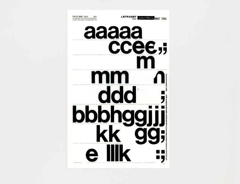
My favourite Letraset typeface was Helvetica Medium, which seemed to be the only one they had at the Tyler School of Art art supply store, where I sometimes worked.
Since I could never rub down the type without it cracking, I used to draw little serifs on it and decorate it in other ways by adding dots and curlicues with a Rapidograph pen. My life long hatred of Helvetica began with Letraset.

Lucienne Roberts, LucienneRoberts+ / GraphicDesign&
My typographer Pop died at the end of 2017. He was a ‘might need that later’ kind of chap, so inevitably there was a lot of Letraset to be found – in his studio, in the attic. Univers, Clarendon, Arnold Böcklin, they were all there.
But I was most taken by the ‘line rules’, the blocks of ‘shading tints’ and those architectural figures in their drainpipes and their flares. They spoke volumes about process and the period to me.
Erik Spiekermann
When I was doing the layout for our school magazine in Berlin in 1965, a friend told me about this amazing new stuff which was supposed to make setting headlines easy. I used to set headlines in hot metal type (in Akzidenz Grotesk, of course) at the press where I did my apprenticeship and paste them into the layout.
My friend sent me a sheet of Letraset. It was Clarendon (version by Edouard Hoffmann and Hermann Eidenbenz at Haas), probably 48 point. So, I learnt to rub down headlines in Clarendon and for the next two years I kept buying sheets of that same face. Haven’t used Clarendon since.
Catherine Dixon
There are many Letraset typefaces I admire but I will always have a great affection for faces such as Sunshine (1971, designed by Mike Daines).
When I was small my Dad was what was known then as a ‘commercial artist’. On those days when school was closed, or if I had to go to work at the weekend with my Dad, I would be given the Letraset catalogue to keep me amused. It was always those sunny display faces of the seventies that I would seek out. And some 40 years or so on they still make me smile.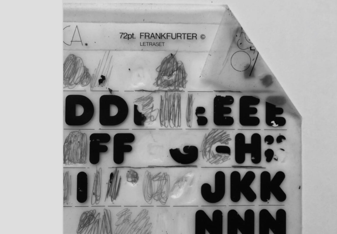
Chris Ashworth
My favourite Letraset font is Frankfurter (1970, designed by Bob Newman). Why? As I often use Letraset to build type illustrations its broad and uniquely-shaped letter forms have given me great elements to build from. And besides, it’s called Frankfurter. I used Frankfurter on a Ray Gun spread for Jesus & Mary Chain in 1998.

Morag Myerscough
For a favourite typeface, I’ve looked through my 1980s Letraset book and cast my mind back to when I used the book all the time and saved my money to buy sheets from the London Graphic Centre – they weren’t cheap!
I’m going to go with what I would choose today – Stack (1969, designed by Les Lawrence, image via Mike Yanega’s Lined Font Guide). I like it! Looks like a hard one to rub-down perfectly.
Tony Brook, Spin
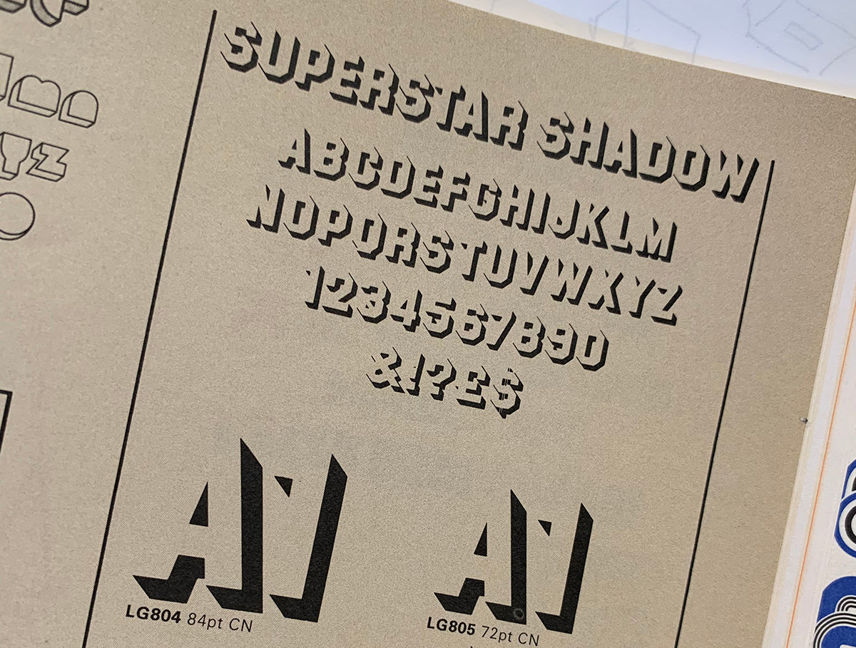
Superstar (1970, designed by Colin Brignall) Straight and Shadow, was always one of my favourites. It’s kind of tough and sharp; it was really easy to manipulate – to make more compressed or expanded. All those hard straight edges were a gift.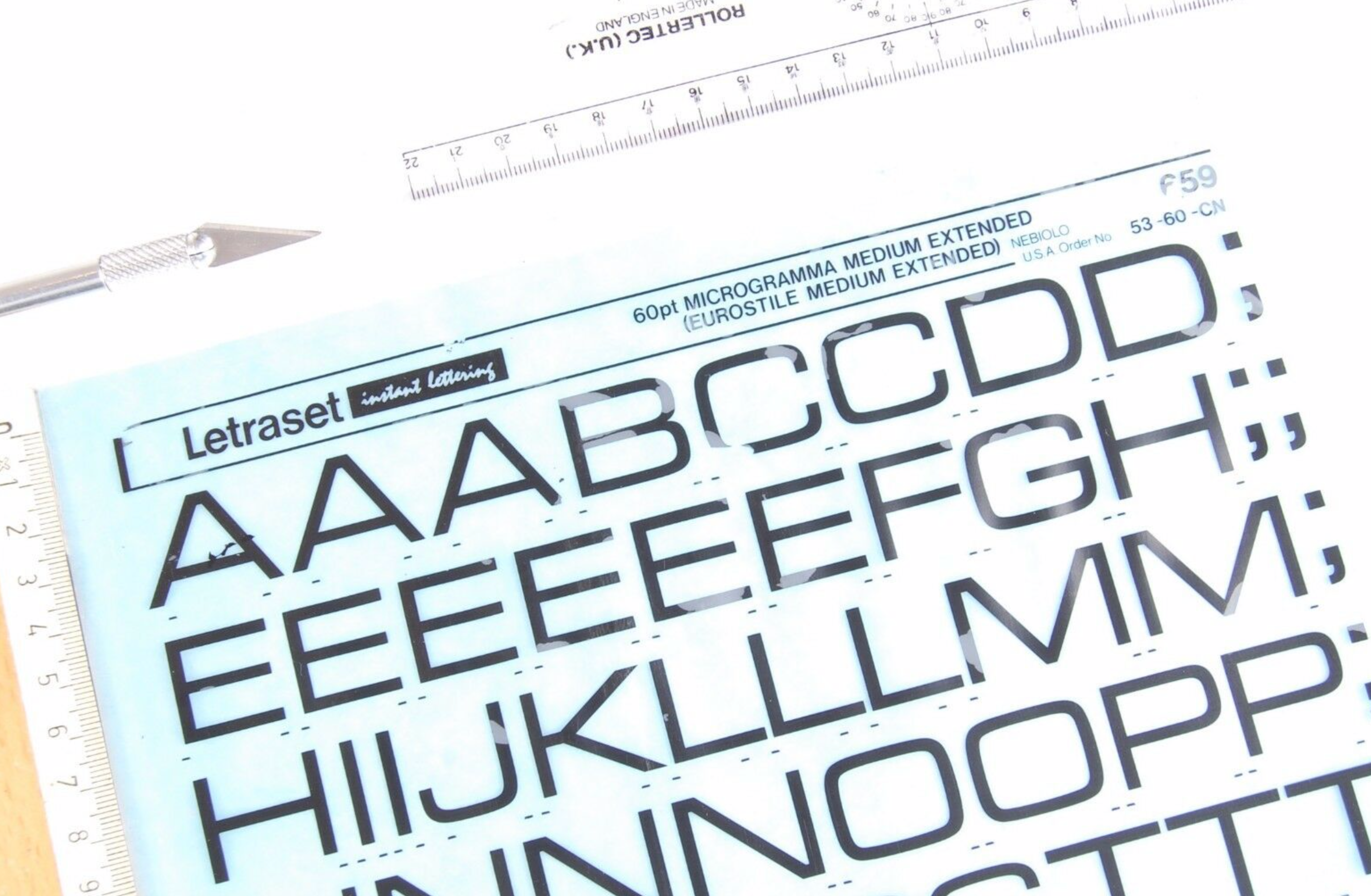
Erik Brandt
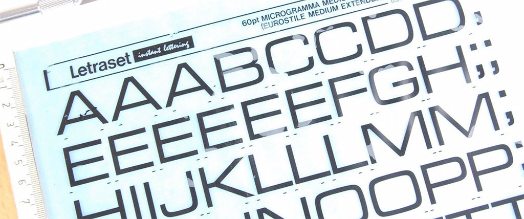
Microgramma (1952, designed by Alessandro Butti and Aldo Novarese) is my favourite Letraset typeface without question, because it formed the cornerstone of my later work in both teaching and practice, but also because of the uppercase ‘K’ — a striking beauty.
Claudia Klat, Spin
My choice is Sinaloa (1972, designed by Rosmarie Tissi). I like it because although it has Swiss heritage (Tissi is Swiss), it doesn’t look like Helvetica or any of the other typefaces we think of when we think of Swiss typography. And I also like it because it is by a female designer – and a very good one, too. 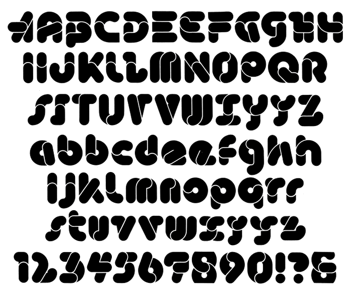
Michael C Place, Build
Beans (1973, designed by Dieter Zembsch). Sourced from my 1974 catalogue, wire-o-bound with a red cover. Why? Because it’s completely bonkers and a really fresh way of looking at how letterforms can be constructed.

Adrian Shaughnessy, Unit Editions
If Barney Bubbles designed a typeface for Letraset (he didn’t) it might look like this. Block Up (1974, designed by Sally-Ann Grover) is not the most elegant face, but it has a funky 3D geometric quality that makes it irresistible (although, back when I used Letraset typefaces regularly, I never used this one).

Domenic Lippa, Pentagram
Shatter (1973, designed by Vic Carless) is an onomatopoeia typeface that delights in its fun and playfulness.
Malcolm Garrett
In truth, I detested all of those Letragraphica fonts designed especially for Letraset in the 1970s as a dubious attempt at being ‘contemporary’. In my view they appeared amateur, appealing to designers with little interest in serious typography. Consequently I equated in-house type design at Letraset not with playful irreverence as intended, but with a certain lack of authority.
For me, Letraset had been simply a convenient and accessible way to produce headlines or logos that looked professional, and retained an unquestionable sophistication.
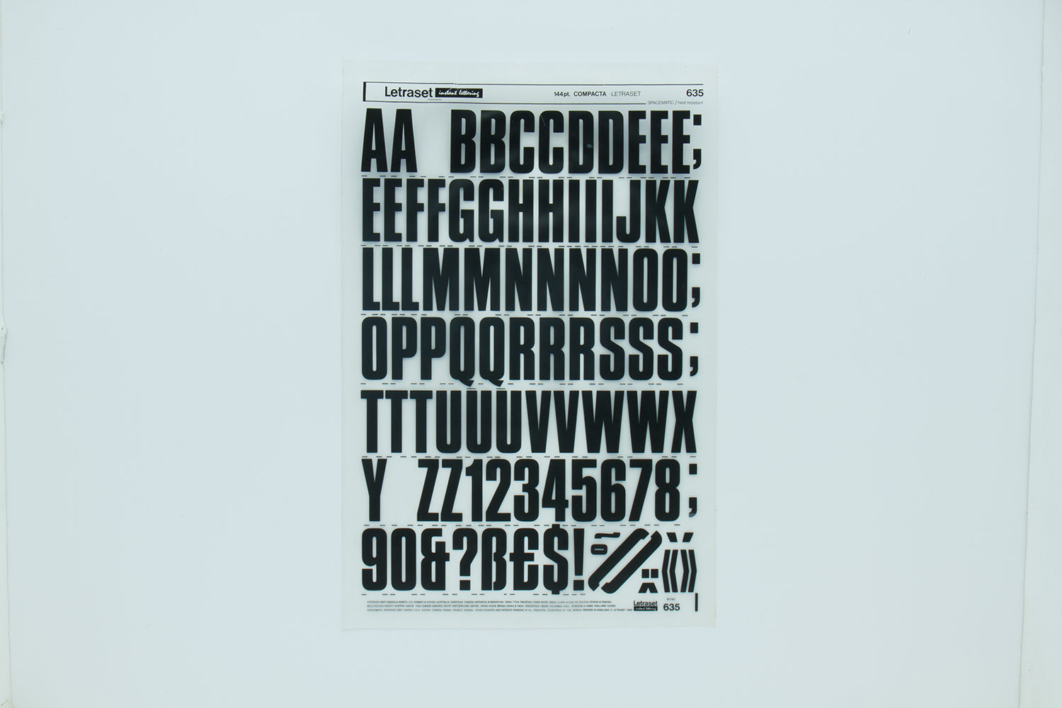
It was with genuine surprise then that I discovered only a couple of years ago that Compacta (1963, designed by Fred Lambert), the font I had used prominently in my first work with Buzzcocks (and which I still return to), was itself designed specifically for Letraset. My earlier prejudice belatedly undone!


Neville Brody, Brody Associates
The revelation for me with Letraset wasn’t so much the new freedom it provided to space, distort, physicalise and curve type in ways that weren’t possible previously with letterpress or even woodblock printing, but the extra opportunity it gave to play with textures, silhouetted clichés and patterns – very much a pre-Mac era of experimentation and post-dada punk playfulness.
My copy of the Letraset book is so well-worn and tattered, and evidences the central and liberating role it played for me at college, and consequently the studio.
As part of our Unit/10 celebrations, for one month only Letraset: The DIY Typography Revolution is available from the Unit shop for £25.
