

Title: North: Extracts from visual identities
Author: North
Design: North
Limited edition of 1000 (each book ships with a free copy of Appendix of visual identities*)
North: Extracts from visual identities is a unique publication documenting the output of one of the UK’s most singular design studios.
The book.
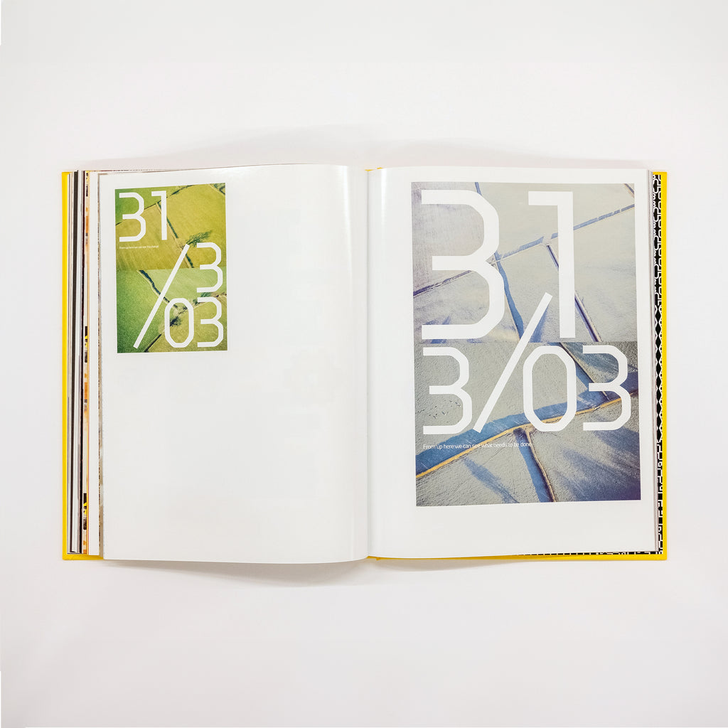
North’s first ever monograph brings together a wide range of visual identities created for various cultural and business clients across the world. Reflective of the studio's international reach, these projects are arranged by geographical latitude – an organising principle is a typical North strategy: unexpected, idiosyncratic, contrarian.
Founded in 1995 by Sean Perkins, North has always followed a highly individualistic path. The studio’s website doesn’t give much away, and the North Instagram account is similarly sparse. It’s almost as if they are a well kept secret. Even the studio’s name, derived from Perkins’ origins in the north of England, stands for plain-speaking visual directness.
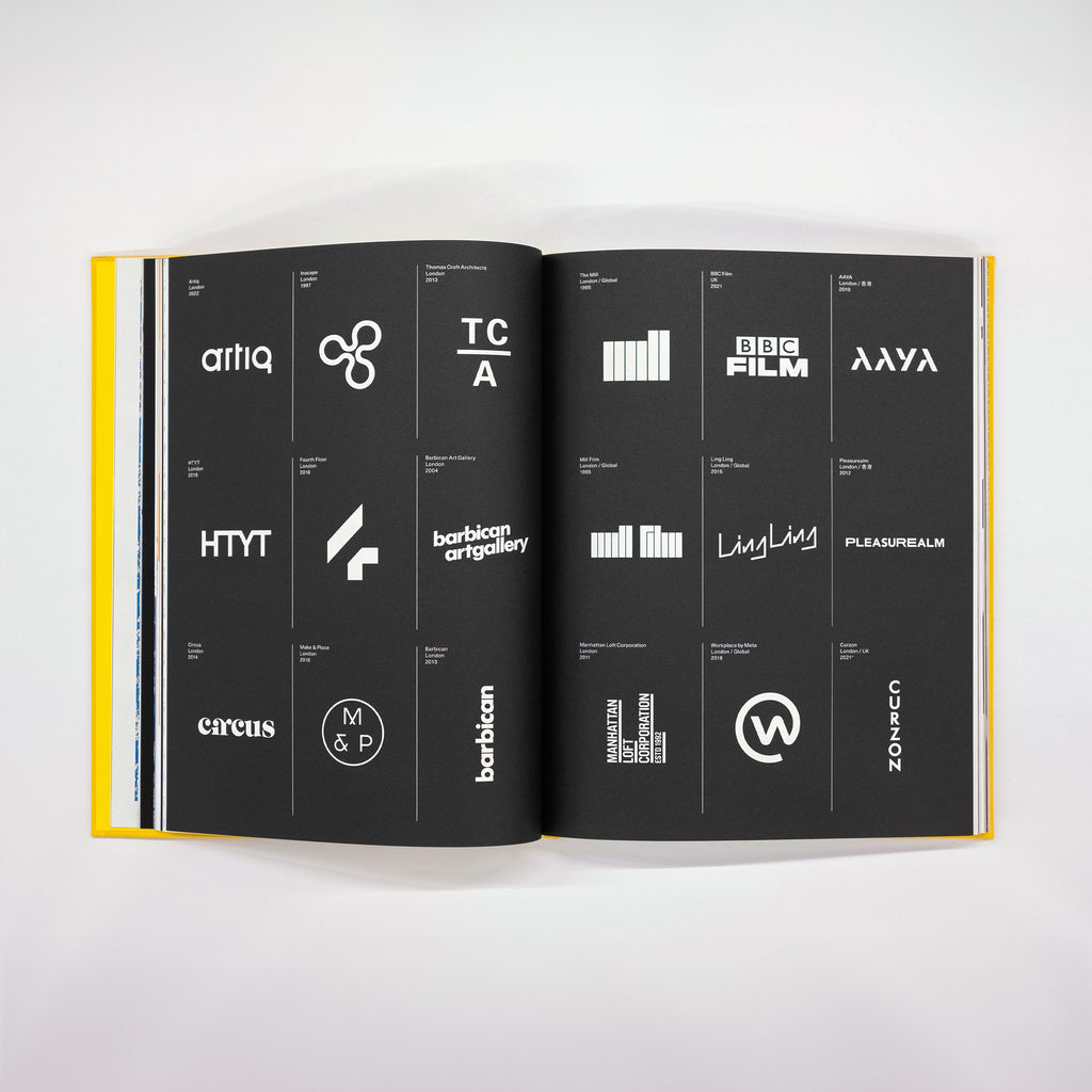
North’s work is the product of sharp research, high-end craft and precise visual expression. And as can be seen in the pages of this book, the result is a rich crop of brand identities, packaging, exhibitions, books, posters and logos clients that includes Tate, Southbank, Munch (Oslo), Co-op, Barbican, Samsung and M+ (Hong Kong).
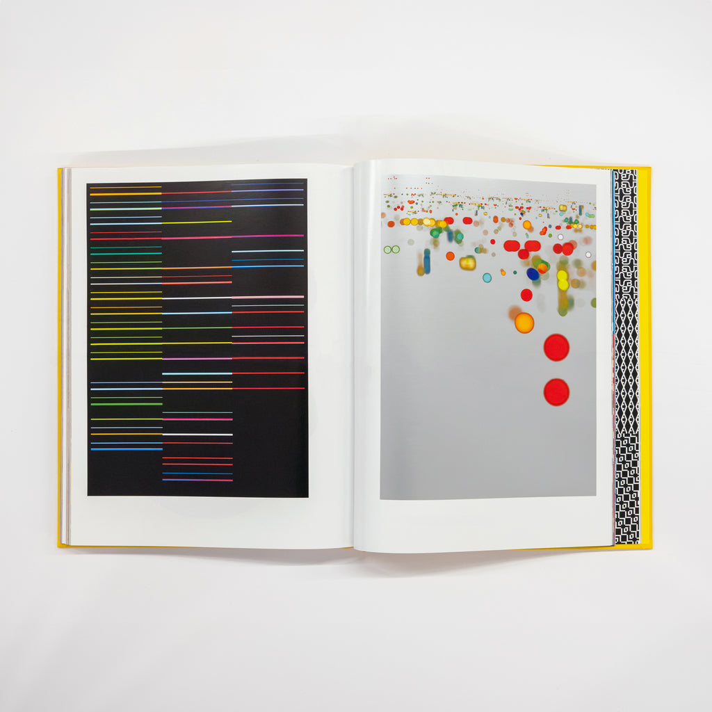
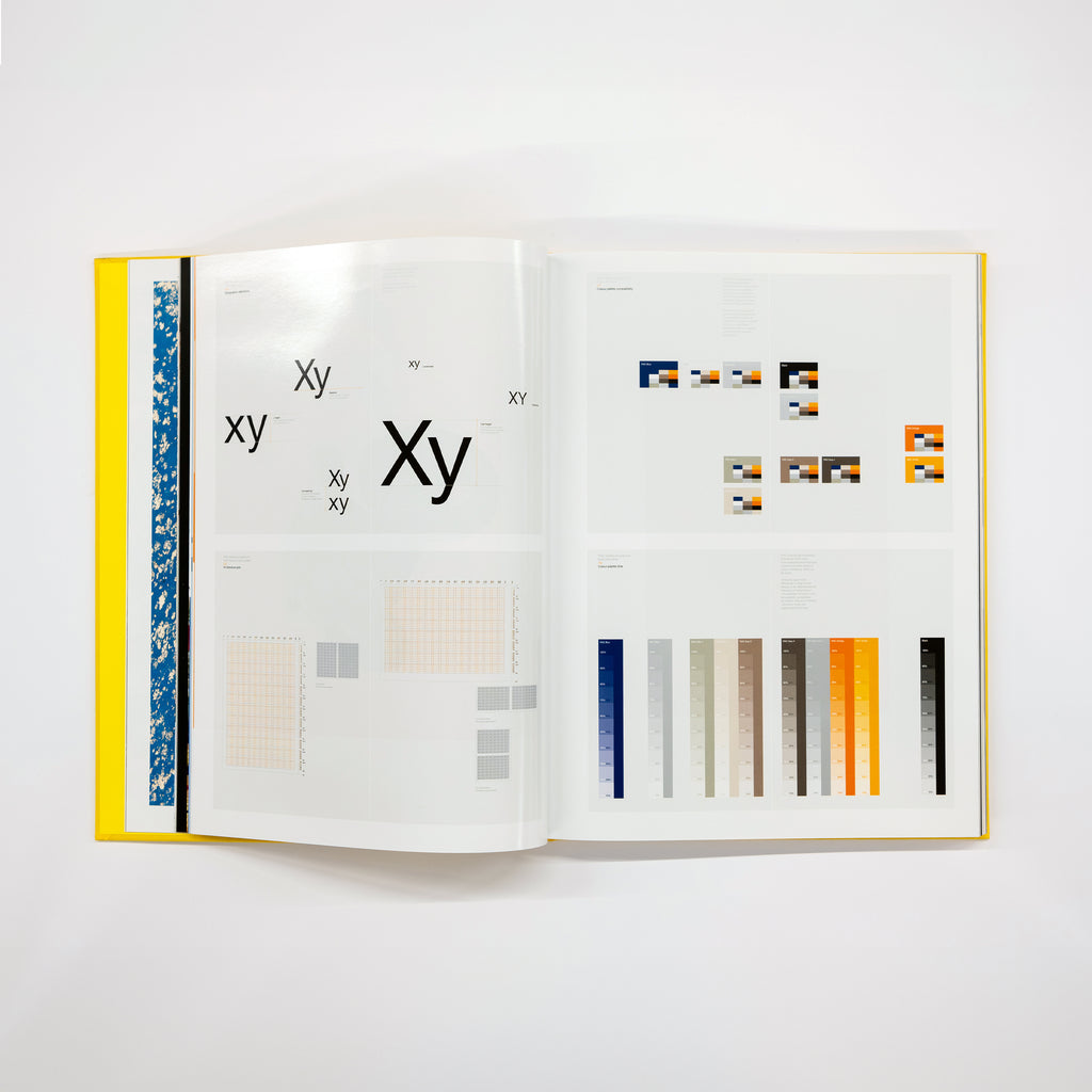
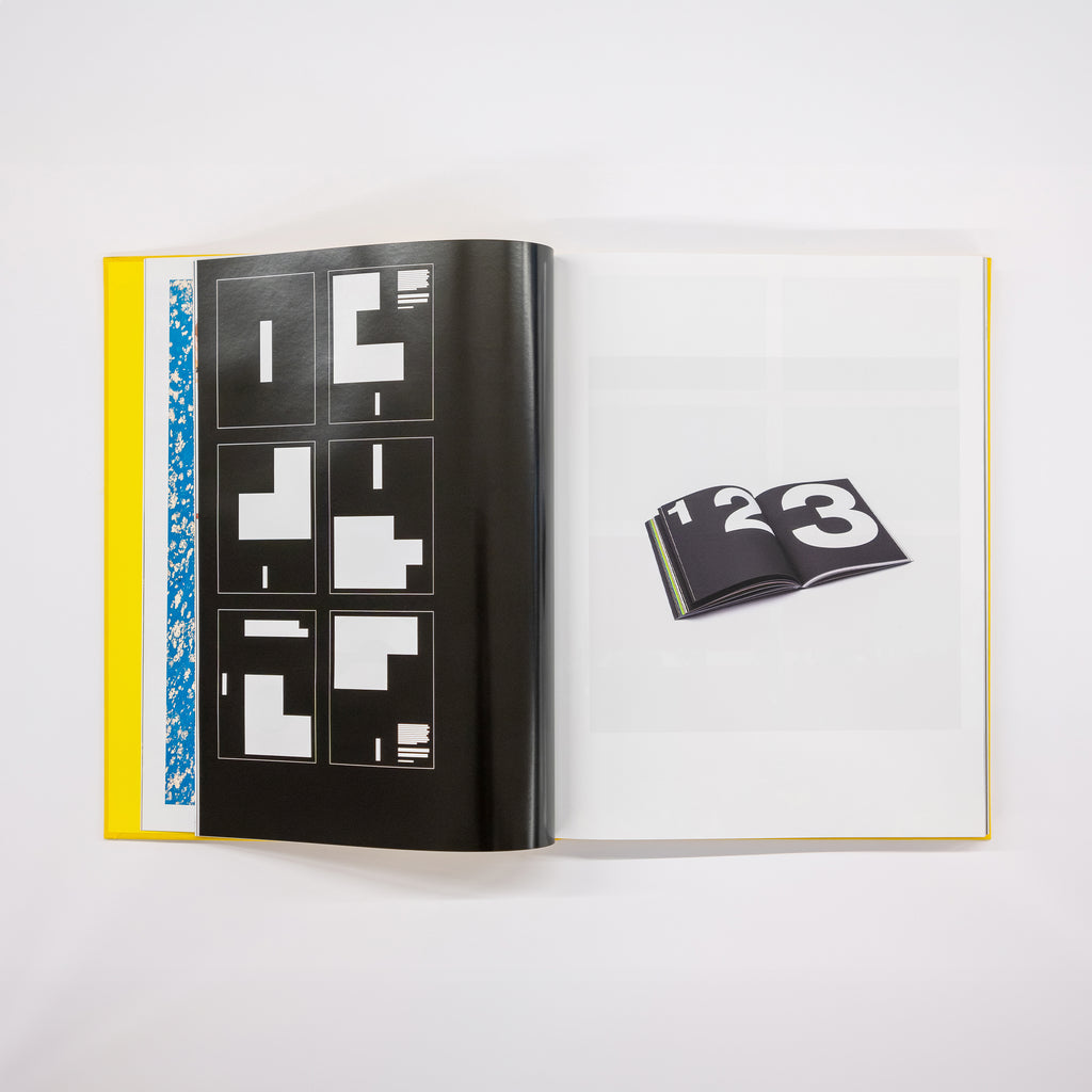
Perkins and his partners Jeremy Coysten and Stephen Gilmore argue that since graphic design is required to ‘speak for itself’ the book dispenses with any descriptive or biographical texts. Instead, the reader is engaged by more than 300 pages of eloquent visual expression, arranged in a rigorously planned mix of photography, typography, layout and colour.
As befitting an exacting studio with a meticulous approach to its practice, the production of North: Extracts from visual identities is second-to-none. The cover features yellow (BRI4058) Brillianta cloth mounted over 2500mic greyboard and is foil-blocked in white.
Inside, the book has been printed in six colours throughout: standard CMYK and spot metallic gold (Pantone 871) and spot metallic silver (Pantone 877). Selected photographs are also reproduced using a combination of CMYK plus integrated spot metallic inks – achieved by using special colour profiles developed by Color Library that generate additional separations.
The typeface used in the book is Neue Haas Unica, developed by Toshi Omagari for Monotype and based on Unica (developed by Team ’77 and released in 1980).
*Each copy of North: Extracts from visual identities also comes with a free 16-page publication consisting of more than 100 unused and unpublished logos designed by North. Appendix of visual identities sheds light on the rejected routes and alternative designs from a wide range of North projects. According to the studio’s Sean Perkins, Appendix is a catalogue of “the ones that got away”.
Specifications.
Size: 300 x 230mm
Pages: 308 pages
Format: Case bound
Printing/binding: Four-colour process including two Pantones (PMS 871 Gold and PMS 877 Silver) and gloss coat on both sides of gloss paper. Thread-sewn book block and case-bound with square spine and Winterband 406 H&T bands
Printer/binder: Pureprint
Cover: Yellow (BRI4058) Brillianta cloth-mounted over 2500mic greyboard. Foil-blocked in white
Endpapers: Colorplan Factory Yellow 135gsm and one Pantone (PMS 877 Silver) and Premier Coat on the face
Papers: White Gloss (FSC) 130gsm (plus gloss coat) and Munken Lynx Rough Natural White 120gsm (plus premier coat)
Typeface: Neue Haas Unica
Available now
Free shipping within the UK (ROW shipping calculated at checkout)